 omergulcicek
Design Token Architecture: Layers, Naming and Themes
· 6 min read · CSS
If the same gray is typed by hand in forty places, that color is not a decision; it is an accident. To change it, you have to hunt down all forty, and you can't tell which one belongs to the button and which one to a border. Miss one, and the site ends up with two grays.
Try it yourself: pick a color and watch how the two cards change.
Without a token
- Button.tsxbg-orange-600
- Checkbox.tsxbg-fuchsia-600
- Icon.tsxtext-yellow-500
With a token
--brand: var(--color-teal-700)
Button, Checkbox, Icon → var(--brand)
1 token, 3 components
Design tokens solve this: they give each decision a name and keep it in one place. Change the value there, and everything that uses the name changes with it. In this post I walk through how that is set up, using Tailwind CSS, shadcn/ui and GitHub's design system, Primer.
What is a token?
The Design Tokens Community Group describes tokens as the indivisible pieces of a design system: colors, spacing, type scales. In short, a token is a design decision with a name. On the frontend, we mostly meet it as a CSS variable.
In Tailwind CSS v4, these decisions live in @theme, and each one creates both a CSS variable and a utility class:
@theme {
  --color-mint-500: oklch(0.72 0.11 178);
}
After this, bg-mint-500 and text-mint-500 are ready to use. The --color- prefix decides which utilities get generated; --spacing-* creates spacing utilities and --radius-* creates border radius utilities.
Three layers
Variables alone are not enough. Writing --color-neutral-900 in forty places is not much better than writing the gray itself forty times: to recolor the button, you still have to find which neutral-900 belongs to it. The fix is to split tokens into layers. Rangle and GitHub Primer use different names, but the split is the same:
| Layer | Primer's name | What it holds | shadcn/ui | Primer |
|---|---|---|---|---|
| Primitive | Base | A raw value with no meaning | --color-neutral-900 | --base-size-16 |
| Semantic | Functional | A system-wide decision | --primary | --fgColor-default |
| Component | Component/pattern | A decision for one component | --sidebar-primary | --button-primary-bgColor-rest |
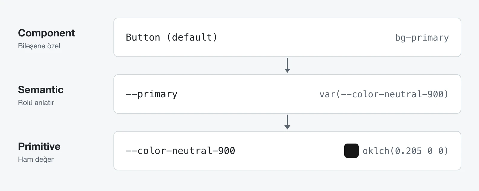
What separates the layers is references flowing in one direction. Components use semantic tokens, semantic tokens point to primitives, and raw values are written only at the bottom. That way the "button color" decision lives in a single name: --primary.
In practice, this means that when you want to turn the buttons from gray to blue, you don't search forty files. You change --primary: var(--color-neutral-900) to var(--color-blue-600), and every component that uses bg-primary changes with it. The gray scattered across forty places at the start of this post comes down to one line here. Primer's token guide puts the rule in one sentence: never use raw values, only use semantic tokens.
Setting it up with Tailwind and shadcn/ui
shadcn/ui ships with this model. Semantic tokens are defined in :root, then exposed to Tailwind with @theme inline:
:root {
  --primary: oklch(0.205 0 0);
  --primary-foreground: oklch(0.985 0 0);
}

@theme inline {
  --color-primary: var(--primary);
  --color-primary-foreground: var(--primary-foreground);
}
This creates the bg-primary and text-primary-foreground classes. The Tailwind docs recommend inline for theme variables that reference other variables. In shadcn/ui, tokens come in background and foreground pairs: --primary is the color of the surface, --primary-foreground the color of the text on it.
Components then use only these classes:
default: "bg-primary text-primary-foreground hover:bg-primary/90"The Button never writes a color value. When the color changes, you don't touch the component file.
Changing the whole site with one line
The accent color on this site is teal, and it comes from a single token:
:root {
  --brand: oklch(0.511 0.096 186.391);
  --ring: var(--brand);
}

@theme inline {
  --color-brand: var(--brand);
}
The site uses this value for:
- the call to action on the home page (
bg-brand), - the current page in the menu (
text-brand), - link underlines (
decoration-brand), - focus rings (
--ring: var(--brand)), - text selection (
bg-brand/25).
To swap teal for another color, I only change the --brand line. Without touching a single component, the accent changes across the whole site. This is the token you changed in the demo at the top of the post.
Naming: by role, not by look
Changing things in one place also depends on the right name. A token called --teal starts lying the day you switch it to purple; --brand says what the color is for and stays true when the color changes.
In larger systems, names are built from several parts. Primer, GitHub's design system, puts them in a fixed order: prefix, namespace, pattern, variant, property, variant, scale. A variant can modify either the pattern or the property, so it has two slots in the order, but a token may carry only one variant. Scale is for ordered values such as size, thickness and interaction state.
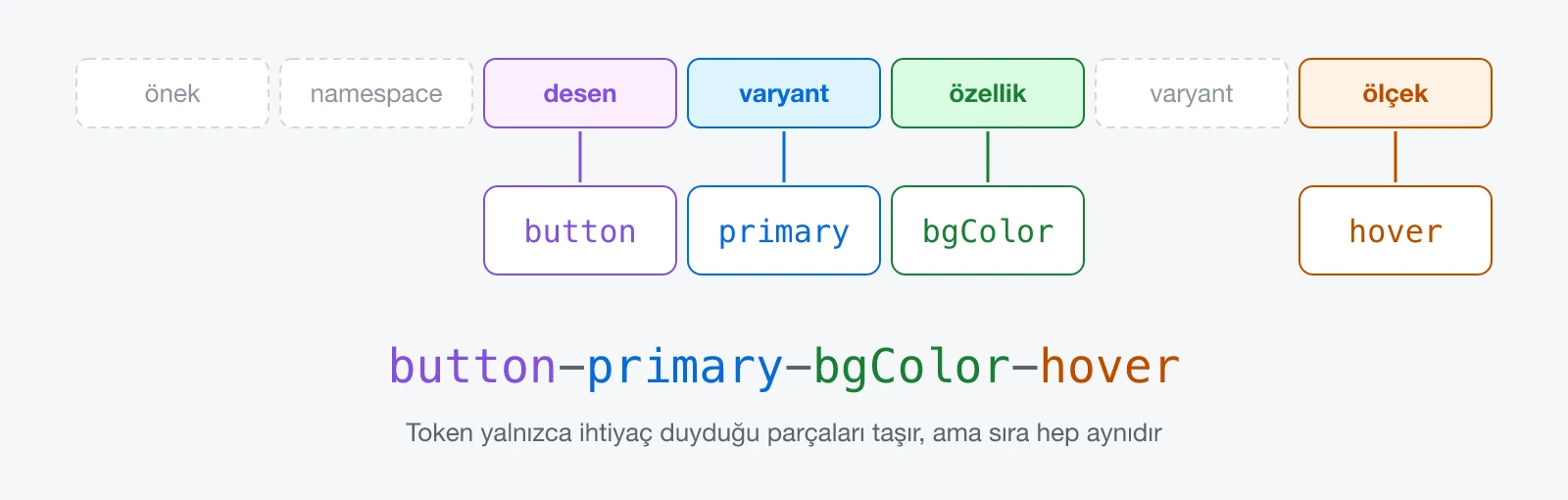
A fixed order makes names predictable. If you know button-primary-bgColor-rest, you can write button-primary-bgColor-hover without looking it up.
How many layers do you need?
Not every system needs all three. Rangle suggests keeping component tokens while a system is young, because when the design changes, only the reference changes, not the code. In mature systems, it suggests removing that layer to cut maintenance. Primer keeps all three; shadcn mostly gets by with two and uses hover:bg-primary/90 instead of a separate hover token.
A practical rule: add a component token when a component truly needs a different value from the semantic token. The ones added "just in case" turn into a list of copies of your semantic tokens.
Themes: change the value, not the name
Dark mode is the same idea taken one step further. You don't touch the components; you give the same names new values under .dark:
.dark {
  --primary: oklch(0.922 0 0);
  --primary-foreground: oklch(0.205 0 0);
}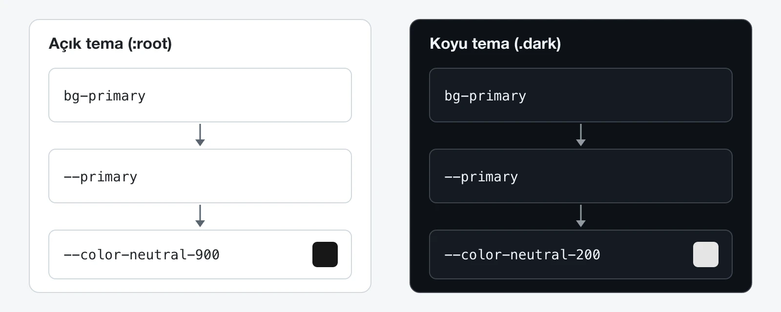
In dark mode, primary turns light, so its foreground turns dark; that's why the pairs are always defined together. Primer does the same with the data-color-mode and data-dark-theme attributes on <html>.
Summary
- A token is a design decision with a name. Its value lives in one place, and everything that uses it changes when it does.
- Primitives hold raw values, semantic tokens hold roles, and component tokens hold one component's decisions. References always flow down.
- A name describes the role, not the look.
- Tailwind and shadcn/ui ship with this structure; your job is to avoid raw values.
- In themes, the values change, not the names.