 omergulcicek
ViraStack's New Logo
· 3 min read · ViraStack
ViraStack's old logo was a rounded shape with a glass effect. It looked nice, but it said nothing about the product: it had no link to the ViraStack name or to what it does. I knew what I wanted: a V, the first letter of the brand. A simple, recognizable symbol that still reads at small sizes.

The glass effect also broke down at small sizes. At 96 pixels and in a 16-pixel favicon test, the old shape turned blurry and hard to tell apart; the new V stays sharp at the same sizes.
In this post, I walk through how I settled on the new logo and the few simple rules I tied it to.
Looking for the right V
I made a lot of attempts at the V, and none of them felt right.
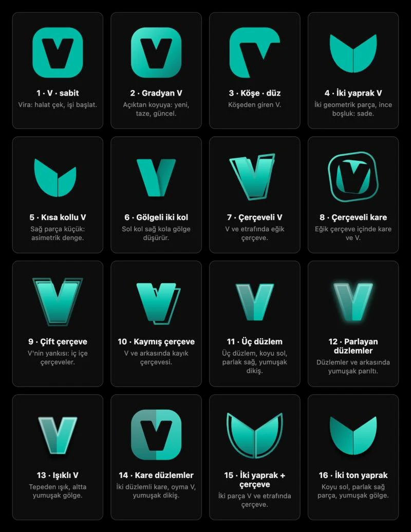
In the end, I gave Claude a few logos I liked from svgl. The goal was not to copy them but to share a direction: the stance, the proportions and the corner softness I liked.
The logo that finally clicked came when I applied the approach behind the Supabase logo to a V, in my own colors.
Two options, one decision
I eventually narrowed it down to two designs. I did not judge the logo on its own; I looked at how it sat next to the wordmark and alongside the product logos. A logo can look great on an empty canvas; the real test starts once text and other icons sit beside it.
I put both candidates on one screen and compared them side by side: at a large size, in the header next to the wordmark, and at favicon sizes.
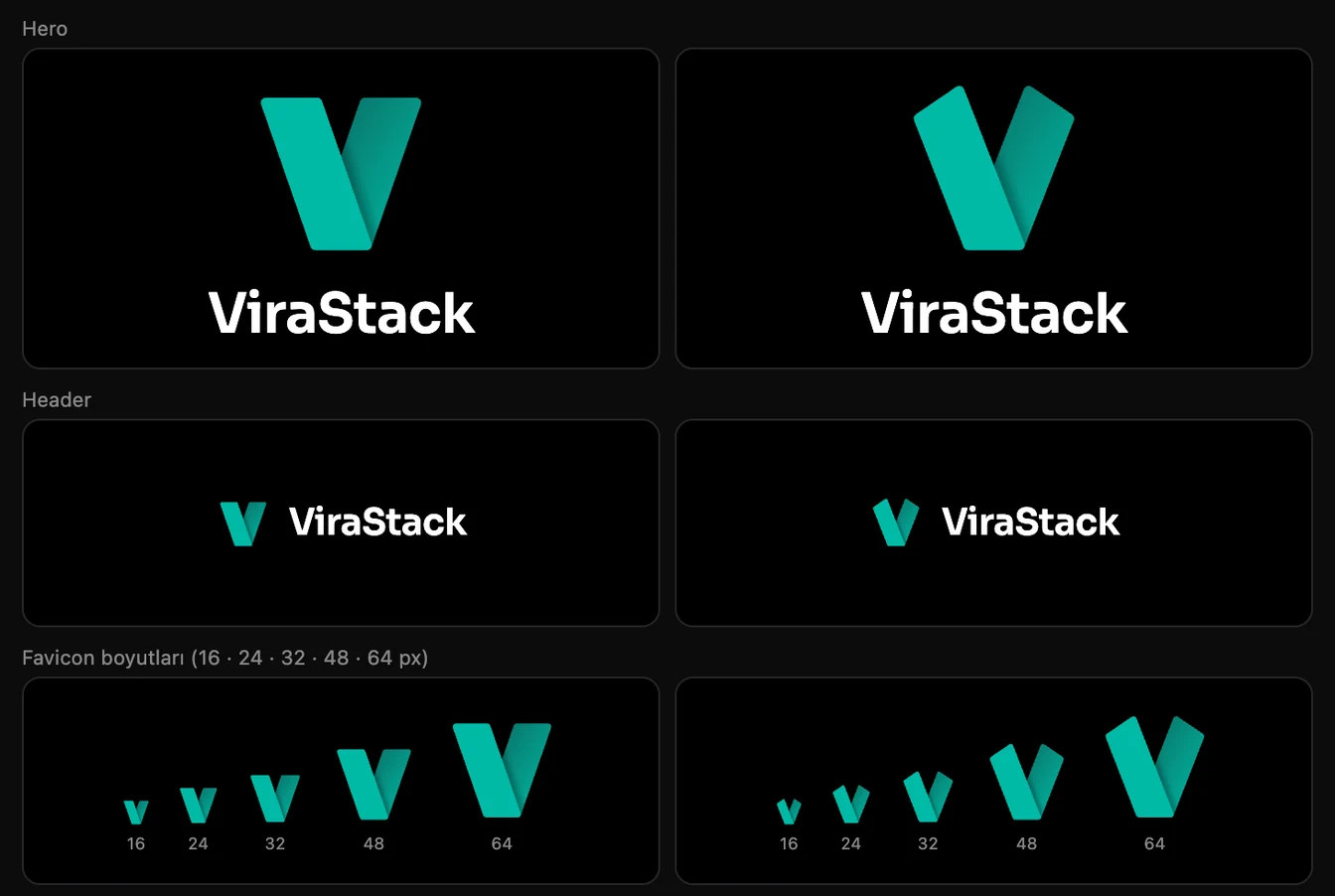
I really liked the one on the left too, but it felt more ordinary. The one on the right looked more modern and more distinctive, so I went with it.
Tying the logo to a system
Once the logo was chosen, looking good was not enough. To keep it consistent everywhere, I gave it a few simple rules.
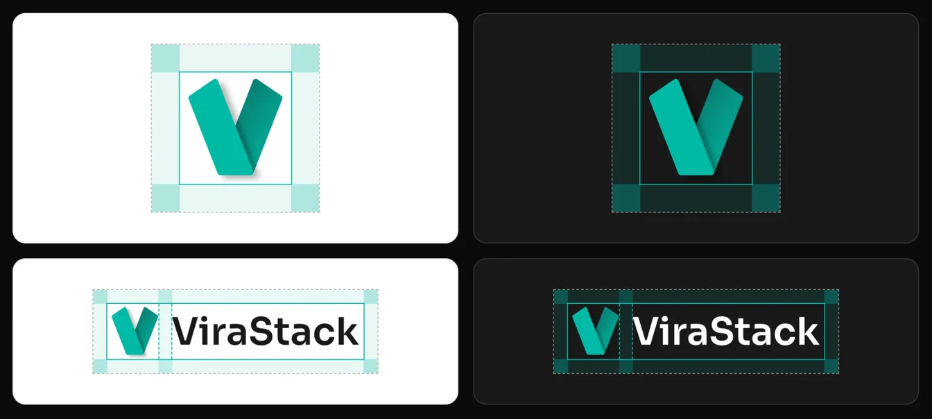
- Clear space: I leave a quarter of the icon's height free around the logo, and between the icon and the name in the wordmark.
- Text height: The capitals in the wordmark are half the height of the icon and centered on it vertically.
All the rules and the downloadable logo files are on the virastack.com/brand page.